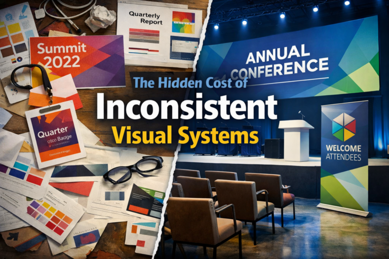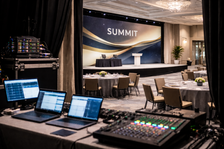
For many organizations, conference branding begins and ends with the stage backdrop.
A logo lockup.
A theme graphic.
A bold color moment behind a keynote speaker.
It looks strong in photos.
But real conference branding has a much longer life cycle.
If it only works on stage, it isn’t working hard enough.
Conferences Are Ecosystems, Not Moments
A conference brand touches far more than the keynote.
It appears in:
Save-the-date emails
Registration pages
Social announcements
Sponsor decks
On-site signage
Wayfinding
Slide templates
Name badges
Environmental graphics
Post-event recap materials
If the identity is designed only for the stage backdrop, the rest of the ecosystem becomes improvisation.
That’s where cohesion breaks.
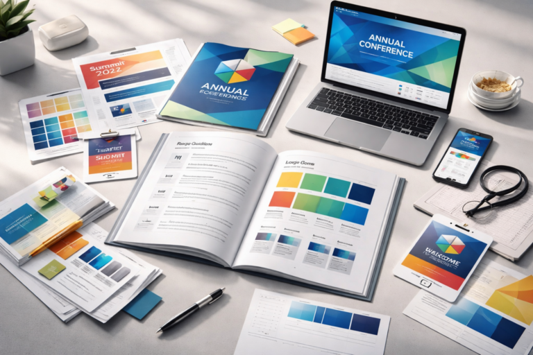
The Brand Should Start Before the Event
Strong conference branding begins months before doors open.
It should:
Translate cleanly into email headers
Scale across landing page modules
Work in small social avatars
Support motion graphics
Align with sponsor placements
If the identity only looks good at large scale, it will struggle in digital environments.
Designing for longevity means designing for compression and expansion.
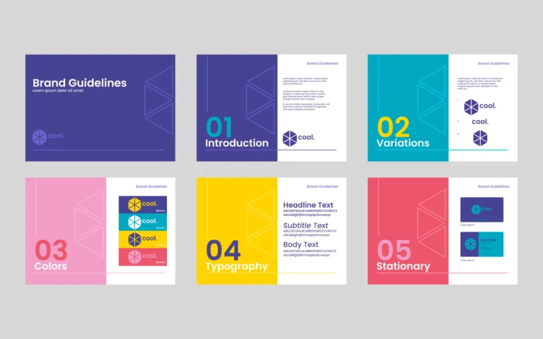
Build a System, Not a Graphic
Conference identities often fail because they are treated as one-off visuals.
A single graphic.
A single layout.
A single hero image.
Instead, think in systems:
A typographic hierarchy that works across slides, signage, and digital
A flexible grid that adapts from email to stage
A defined color range that can expand without losing cohesion
A set of graphic motifs that scale
When you build a system, the brand lives beyond any one application.
Align the Event With the Parent Brand
One of the biggest mistakes I see is event branding drifting too far from the core organization.
The event becomes visually disconnected.
It may feel fresh — but it feels separate.
Strong conference branding should:
Extend the parent brand
Reinforce organizational identity
Maintain typographic consistency
Share structural logic
Distinct doesn’t mean detached.
The best event brands feel like chapters of a larger story.
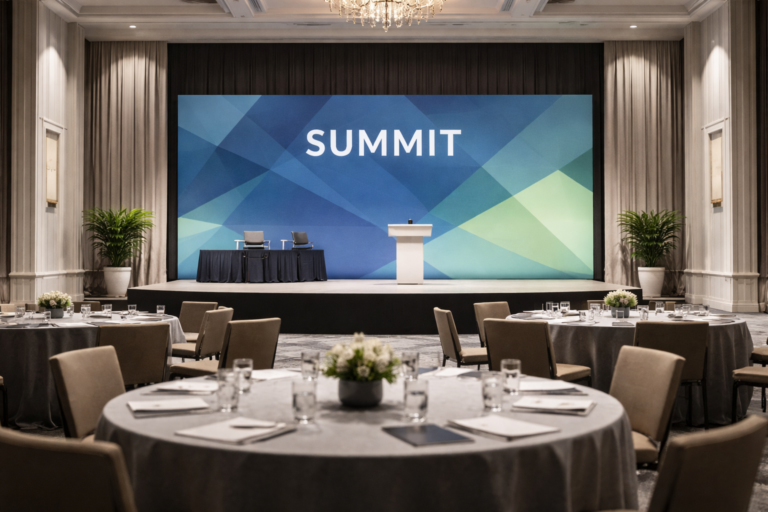
Design for Physical and Digital Scale
Conference branding must work in multiple dimensions:
10-foot stage backdrops
2-inch social avatars
High-resolution print
Responsive websites
Projection environments
Environmental lighting
Color behaves differently under stage lights.
Typography reads differently at distance.
Gradients compress differently in email.
A conference brand that truly lives beyond the stage accounts for all of it.
Think About the Afterlife
The strongest conference brands don’t disappear when the lights go down.
They extend into:
Post-event content
On-demand video platforms
Social recap campaigns
Future event iterations
Year-over-year evolution
When designed thoughtfully, a conference identity becomes an evolving framework — not a disposable theme.
That continuity builds recognition over time.
The Goal: Cohesion Without Rigidity
Great conference branding is flexible.
It allows:
Thematic variation year to year
Sponsor integration
Program differentiation
Digital adaptation
But it never loses its foundation.
When done well, attendees may not consciously notice the cohesion.
They simply experience clarity.
And clarity builds trust.
—
If your organization is preparing for an upcoming conference and wants branding that scales across digital, environmental, and print touchpoints, I’m currently opening space for one ongoing creative partnership this quarter.
— Sam Segal