When an organization starts talking about a logo refresh, it’s usually a symptom.
Not the cause.
The conversation often begins with something like:
“Our brand feels outdated.”
“We need to modernize.”
“Our competitors look sharper.”
“The logo just doesn’t feel right anymore.”
But in many cases, the logo isn’t the real issue.
It’s what the logo is sitting on.
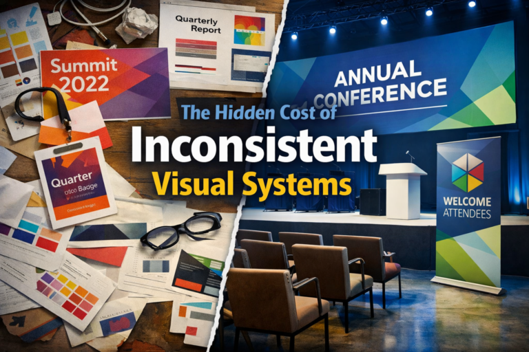
The Logo Gets Blamed First
A logo is visible. It’s easy to point at.
If the brand feels fragmented, inconsistent, or unclear, the logo becomes the most convenient target.
But refreshing the mark without addressing the underlying system rarely fixes anything.
Six months later, the same friction returns.
Because the problem wasn’t the symbol.
It was structure.
The Real Issues I Often See
When organizations ask for a logo refresh, the deeper challenges usually look like this:
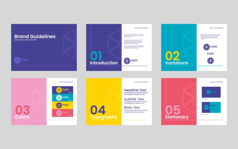
Inconsistent typography across materials
No clear hierarchy between parent brand and events
Overlapping sub-brands with no system
Templates built independently by different teams
A CMS that doesn’t reflect the brand’s intended design
No governance or ownership
In that environment, even a beautiful new logo will drift.
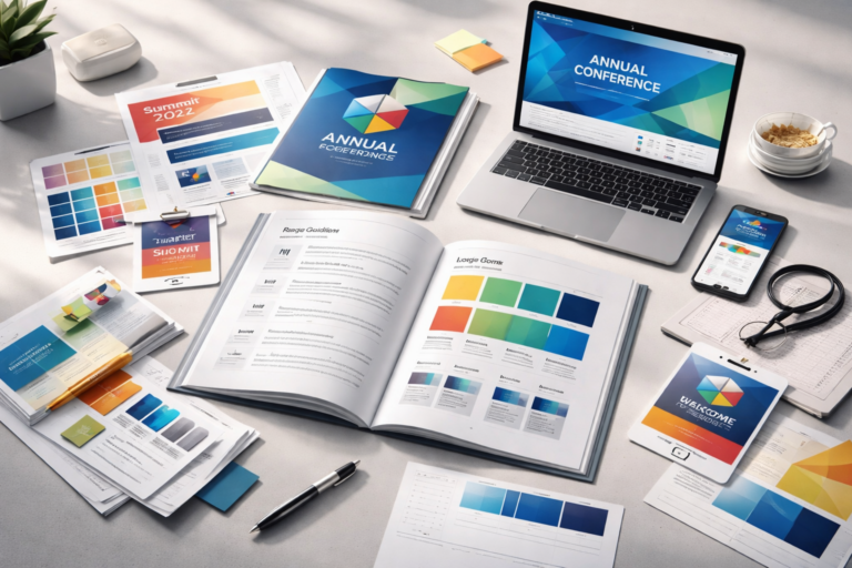
A Logo Cannot Fix a Broken System
Logos are identifiers.
They are not infrastructure.
If the underlying brand lacks:
Modular layouts
Clear typographic standards
Defined color usage
Event extension rules
CMS-aligned components
Template systems
Then a refresh simply places a new mark into an unstable ecosystem.
The result?
Initial excitement.
Temporary alignment.
Gradual inconsistency.
And eventually — another refresh conversation.
When a Logo Refresh Is the Right Move
There are legitimate reasons to evolve a mark:
Mergers or structural shifts
Mission evolution
Major repositioning
Accessibility improvements
Digital scalability issues
But even then, the logo should be the final expression of a broader system — not the starting point.
A Better Starting Question
Instead of asking:
“Do we need a new logo?”
Try asking:
“Where does our brand break down operationally?”
Where does inconsistency show up most often?
What materials get rebuilt from scratch?
Where do teams improvise?
What frustrates marketing staff the most?
Those answers usually reveal the real problem.
And the real opportunity.
Think System First, Symbol Second
Strong brands function cohesively across:
Events
Digital platforms
Print materials
Social channels
Internal communications
Vendor collaborations
If those touchpoints aren’t aligned, the solution isn’t aesthetic.
It’s architectural.
When the system works, the logo feels stronger automatically.
Because it lives inside clarity.
—
If your organization is considering a logo refresh, I’m always happy to have a strategic conversation first. In many cases, refining the system creates more impact than redesigning the mark.
— Sam Segal